Analysing 2025-2026 Design Trends
- May 27
- 5 min read
If 2024 was the year of “clean girl” minimalism, 2025–2026 seems to be pushing back a little.
Things are getting weirder, bolder, and more emotional. Brands are swapping perfect polish for texture, experimenting with nostalgic references, clashing colours, surreal worlds, handmade details, and visuals that feel like they actually have a personality again.
That said, trends are exactly that, trends. Not every one will suit every brand, and blindly following them is usually a fast route to looking dated. But they do tell us something interesting about where culture, consumer behaviour, and visual taste are heading. So, here are some of the design trends quietly (and not so quietly) shaping 2025–2026.
Hyperreal Gradients
Gradients are making a comeback, but not in the sleek, tech-startup way we saw a few years ago. This new wave feels bolder, moodier, and far more tactile. Colours blur into one another with a soft, almost airbrushed finish, creating packaging that feels immersive rather than flat.
What makes this trend feel fresh is its emotional quality. Rather than simply decorating packaging, gradients are being used to build atmosphere. They create a sense of energy, softness, warmth, mystery, or even escapism, often making products feel more sensory and experience-led. In beauty, wellness, food, and drinks especially, gradients are becoming a shortcut to mood, helping brands communicate a feeling before a customer has even picked up the product. When paired with bold typography or simple layouts, these gradients feel striking, contemporary, and highly memorable.


Chrome Revival
Reflective metallics and chrome finishes have been everywhere this year, adding a futuristic edge to branding, packaging, and campaign imagery. What’s interesting is that it doesn’t feel as harsh or cyber-inspired as the chrome we saw in the early 2000s. Instead, it’s softer, more liquid, almost melted in places.
I think part of why this trend works so well is the contrast it creates. Chrome instantly makes branding feel more elevated and high impact. It feels nostalgic without being cheesy, futuristic without feeling cold, and playful while still managing to feel premium.


Ugly Beautiful Colour
Colour palettes have been getting a little weird… and I’m here for it. Rather than sticking to traditional colour theory or palettes that feel safe and harmonious, designers have been experimenting with pairings that almost feel wrong at first glance, but somehow work beautifully together. Think muddy browns with electric blues, acidic greens paired with soft purples, or rich reds sitting alongside unexpected pops of lime.
I think this trend feels especially refreshing because we’ve had years of safe palettes dominating branding. Beautiful? Absolutely. But after a while, everything starts blending together. These bolder, more unusual combinations instantly feel more memorable and personality-driven.
What I love most is that there’s something slightly uncomfortable about them at first, they make you stop, look twice, and wonder why on earth it works…


Sculptural Packaging
It feels like brands have finally realised packaging can be more than just a container. Rather than sticking a nice label onto a standard bottle and calling it a day, this year has seen a huge shift towards products that feel sculptural, tactile, and genuinely exciting to hold.
From pebble-like skincare bottles to asymmetrical perfume packaging and almost totemic wellness products, there’s been a noticeable move towards shapes inspired by nature and organic forms. Rounded edges, fluid lines, and imperfect silhouettes have helped products feel softer and more tactile.
I think part of what makes this trend so successful is the experience it creates. Consumers are increasingly drawn to products that feel collectible and intentional, almost like miniature pieces of decor rather than something to be hidden away in a cupboard. In many cases, the shape itself becomes the branding. I honestly can’t see this trend disappearing anytime soon either. In a world where everything is competing for attention, creating something people actually want to leave out on their shelf feels like a very smart move.


Anything But A Canvas
Branding this year has stepped far beyond traditional packaging and print, appearing in places we wouldn’t usually expect to see it. Rather than relying solely on labels, posters, or digital assets, brands have been experimenting with identity in more playful ways, turning everyday objects, materials, and environments into part of the experience.
From logos stamped into food and embossed onto unexpected surfaces to branding sprayed onto pavements, carved into snow, or worked into textures and materials themselves, there’s been a noticeable shift towards creating identities that feel more immersive. In many cases, the branding almost feels discovered rather than placed, making it feel more authentic and engaging. Brands aren’t just trying to look good anymore, they want to create moments people remember, photograph, and share.


Good Enough To Eat
We’ve been seeing more and more non-food products advertised alongside food. Lip balms melting into ice cream, skincare balanced on cocktails, perfumes tucked inside fruit, wellness products styled like sweet treats. Suddenly, everything looks weirdly edible.
At first glance, it feels unrelated, but there is actually something quite clever happening here. Food naturally evokes desire. We associate it with pleasure, comfort, indulgence, texture, and reward. By placing products alongside rich desserts, juicy fruit, melting ice cream, or glossy drips, brands are making products feel more desirable. Suddenly, a lip balm feels juicy, a moisturiser feels creamy, and a fragrance feels almost tasteable.
It’s clever because brands are no longer just selling a product, they’re selling an experience. In a world where clean studio shots are everywhere, making something look genuinely craveable is what makes it stick.


The Human Touch
In a world increasingly shaped by AI and hyper-polished visuals, many designers this year have been moving in the opposite direction, embracing imperfection and bringing a more human touch back into branding.
Grain, hand drawn lettering, paper textures, print effects, halftones, and scanned elements have been making a strong comeback, adding warmth and personality to otherwise clean digital work.
Alongside this, mixed media design has been everywhere. Collage, layered imagery, photography paired with illustration, handwritten details, scribbles, cut-outs, and visible handmade marks have all helped create branding that feels more expressive. Rather than aiming for perfection, many brands are leaning into rough edges, visible process, and even intentionally “bad” drawings to create something that feels more honest.


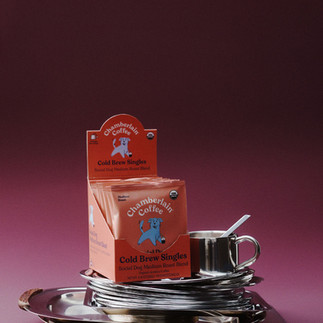
Surreal Product Worlds
Perfume balanced on vintage silverware. Skincare perched inside martini glasses. Lip balm styled beside flowers from another planet. Product photography lately has become far more theatrical, with brands building surreal, carefully curated worlds around products rather than simply showing them. But why is this style suddenly everywhere?
This visual direction feels heavily inspired by the theatricality of 1960s and 1970s advertising, particularly old perfume campaigns, editorial still lifes, and glossy department store displays where every object felt overly styled and slightly mysterious. There is something undeniably retro about the dramatic lighting, reflective surfaces, rich shadows, and carefully arranged props. Yet today’s interpretation feels stranger, more surreal, and intentionally overly polished.
Rather than simply photographing products, brands are building miniature worlds around them. Fruit, flowers, tableware, metallic trays, stacked objects, gloves, strange textures, and seemingly unrelated props all become part of a carefully art directed composition. The result feels cinematic, luxurious, and oddly captivating. These strange little still lifes feel impossible to ignore. They’re beautiful, a bit absurd, and just confusing enough to make you stop scrolling.


So, what can we take from 2025–2026?
Perhaps the biggest shift of all is that design feels far more emotional again. Across branding, packaging, and campaign imagery, brands are moving away from ultra-clean perfection and leaning into personality, texture, tactility, nostalgia, and visual storytelling. Whether through sculptural packaging, surreal worlds, unusual colour pairings, or imperfect handmade details, there seems to be a growing desire to create work that feels memorable and genuinely human.
Of course, trends will continue to evolve, shift, and surprise us. Some will quietly disappear, while others may shape design for years to come. But if there is one thing 2025–2026 seems to be proving, it is that personality is back, and I’m very glad to see it.


Comments